I’m not a super regular visitor to Politico however, I picked the site to analyze in terms of usability. I am not a super big fan of the way the page is laid out, however there are many positives and negatives.
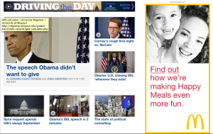
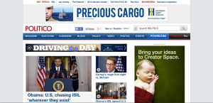
Starting simply with the homepage, the title “Politico” is very small, although that is not important. There is an extremely large advertisement on the right side that almost catches your eye more than the prominent photo, that today is of President Obama.  This is contrary to Krug’s guideline to “create a clear visual hierarchy on each page. Although the photo of President Obama is larger than the other photos on the page, it is dominated by the ad, and not that much larger than the others. In addition, most of the following photos are all the same size, which although gives them authority over the features without photos, still doesn’t set them aside much from others.
Although the site is broken up into different categories as shown by the menu, I do not like the homepage. I think there are far too many options presented as you scroll down, it becomes overwhelming. It is broken up into areas via the menu, however the homepage just appears to be a long list of the most popular stories.
Politico does however follow number four and five of Krug’s guidelines very well. It is very obvious what is clickable on the homepage and throughout. On the home page, all of the links are blue, and this trend continues when you are on an actual article. The blue tabs at the top on the menu are also very obviously clickable and gives the reader ideas of where to go. The site also minimizes noise. Despite its many ads, none of the ads are pop-ups nor do they automatically start playing videos.
Overall what politico lacks for in organization and following Krug’s guildlines it makes up for in pure content. It is very heavy in the amount of articles presented, but just seems to be a bit messy.
