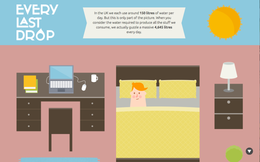
When I first read the prompt for this post, I knew exactly which site I would choose. I came across the British site http://everylastdrop.co.uk/ this summer when I was researching water conservation for work. Water can be a pretty boring topic. Yet, somehow this site manages to make it look fun and fresh and really engaging. It initially caught my eye because of the illustrations — as a designer, I love to illustrate in my free time. However, what makes it really incredible is the user experience. As a user scrolls, the person moves throughout the page as they would move throughout their day with relevant facts about water popping up. For example, it begins at night and as you scroll, the sun comes up with the first fact (see above). You continue scrolling the guy moves from bed into the shower, where more facts come. He then moves into his closet, along with more facts. At the bottom right corner is a little circle with an arrow that a user can click to bring them back to the beginning. I really like this because it functions as a story, guiding the user through their day. One flaw is they don’t have an easy navigation to get back to a certain fact or part of the day. If I want to see the facts about water and clothing, I have to scroll through everything again to get there.
As for incorporating parts of this design into my own design, I think that figuring out the smooth scrolling effects is a great way to make a story flow through design. Moreover, I loved their use of color. They used colorful, yet slightly muted, colors to create an engaging page that screamed fun and interesting, not dull. It would have been easy to use a blue layout for water, but they chose to be more adventurous and I think it paid off because it seemed like they were trying to reach a more youthful audience and the use of their colors and illustrations was very intriguing. As for their multimedia, they had a video at the end with more information to really tie the concept in together. They used illustrations, videos and words to tell a very effective story.
Overall this was much more complicated than I could have done, but it did show that you can tell a story in a way much more effective than just words. Telling a story by creating a story is another great way.

This website is amazing! I am very impressed by the creative storytelling, that when you scroll you actually unfold a person’s daily life interacting with water. I agree with you, the illustration makes the boring topic lively and vivid. It looks simple and interesting, but involves a lot interaction with audiences, which is very important for web design and to convey information such as water conservation. I hope I can learn this story presentation skills and tell stories in a creative way.
LikeLike
I like the color scheme of the website, it is soft and make people feel very comfortable. The scroll down action design is also very simple and made the website easy to use. The scroll down online content design is also very popular in recent years. The website did a great job incorporating different media into the story. I think one of the most amazing feature for the site is it relates each scene to information about water, so abstract information imaginable to readers. I agree with you that it is frustrating that there is no navigation bar and I have to scroll back and forth if I want to go to a particular time of day. I also wish I could click on the shapes and objects in the scene so I can learn more about water facts related to those objects.
LikeLike